April 8, 2020
Just added new data to the Curve polynomial regression model and the trend toward a curve continues, as shown in Chart 1 below.
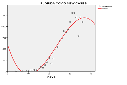
The red trend line is starting to bend, but at this point I wouldn’t send out those “After Coronavirus Party”invitations just yet. This trend line seems a little too curved considering the latest Covid cases. One of the data points could be an outlier. We need a few more confirming cases before we know if this is the real deal.
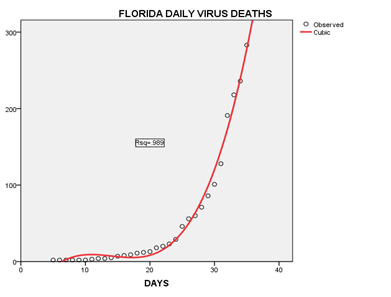
The current trend line is still moving upward, which is expected at this point since there is a significant lag time between when new cases appear and when a victim succumbs to the virus.
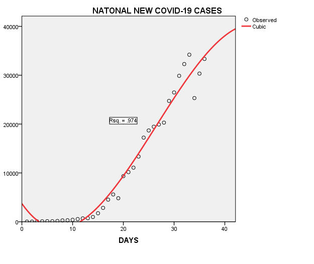
The latest national data is also beginning show a slight curve now as well. This is encouraging since it seems to be following, although slower, the Florida model. Perhaps a confirmation the trend is national.
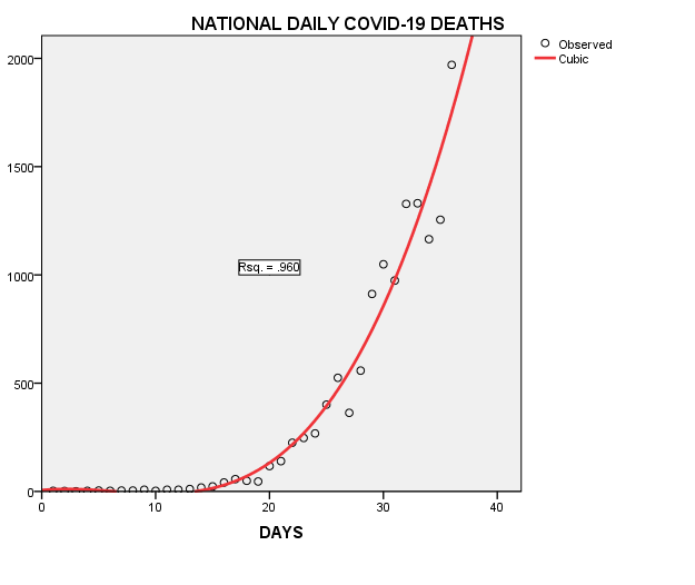
And the national pattern for daily deaths nearly matches the Florida model as well, as shown in Chart 4 above. Again, there is considerable a considerable lag between a new case and an eventual new case. The US fatality rate is currently 3.13% of new confirmed cases.
I’ll be updating these charts to see if they are false alarms or actually the beginning of the big curve. So check in regularly so can tell all our friends how you predicted when the great coronavirus curve began. Stay safe…