Infectious disease experts claim that Covid-19 infections will eventually peak, flatten and decline. Some of you are probably sitting home in your underwear (I can’t, I have kids at home) watching TV news or on your computer regularly checking the latest charts to see if you can spot that moment when the curve begins to flatten out and eventually begin the decent toward our freedom.
The problem for us chart watchers is that the graphs we are using are not that sensitive to the slight nuances of the day to day data changes that most charts use. That’s because most are linear bar charts that are linear and can only go up, go down or sideways. Waiting for the curve is like “Waiting for Godot.”
But now you have an alternative to that old fashioned bar chart, one that moves in a curvilinear fashion and sensitive enough to catch that curve that will hopefully free us all.
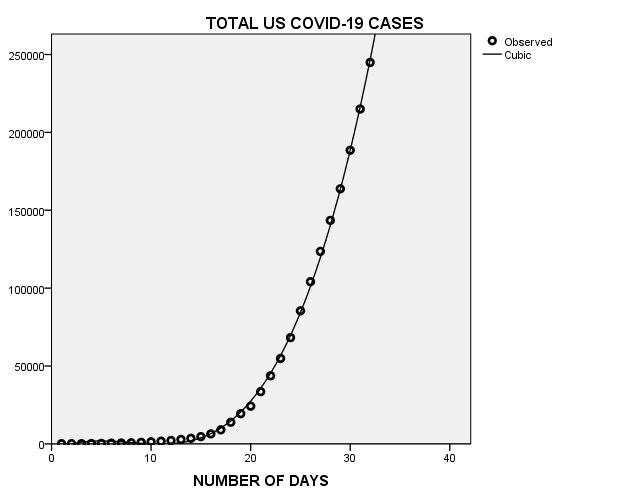
This chart plots the daily number of US coronavirus cases since the beginning of March. Each dot represents the number of confirmed cases on each day which range from 25 to 29,874 cases per day. This model uses a non linear regression equation (cubic) which is designed for nonlinear data, such as the spread of the coronavirus.
It is also an excellent description of how the virus spreads. Looking at the chart, notice after the first case was confirmed, it spread rather modestly until the it reached the fifth day. At that point, the virus went from a daily total of 116 cases and jumped to 396 cases by the tenth day, a percentage increase of 241% in five days! This bug spreads fast…
By the 20th day, if was off to the races and it hasn’t stopped since. Most importantly, there is no indication it is slowing down or making the “curve” we all want.
And what about Florida? Perhaps not surprisingly, it’s using the same playbook as the national spread of the virus. In the graph below, you will see the similarity of the national data.
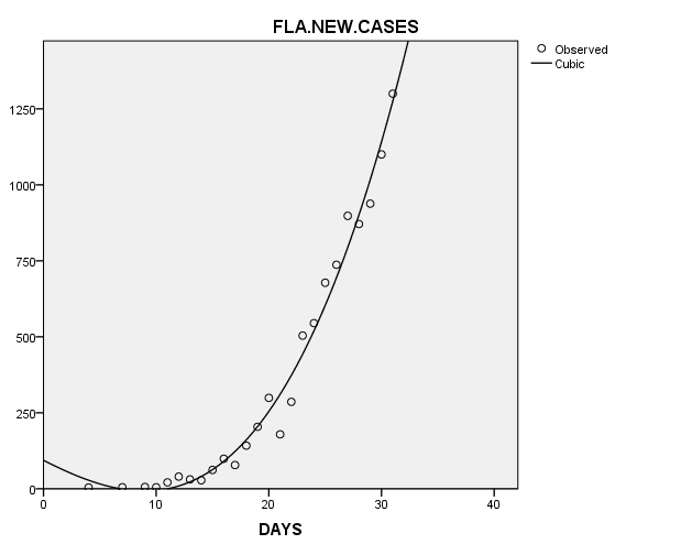
The pattern in Florida mirrors what’s happening nationwide, just a little slower. It starts out slowly and when it reaches the 15th day, it turns on the rockets. And by the end of the month it infects 1300 Floridians.
These nonlinear charts will show the the curve of new cases as it occurs more clearly than a traditional linear bar chart. I will be posting these graphs on a regular basis, so you can see the curve clearly when it begins to flatten and eventually, its downward movement to life before the pandemic. I can’t wait.